
Before You Build the Art: How Visual Prototyping Can Protect an Indie Game From the Wrong Direction
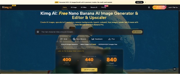
An indie game can survive rough placeholder art for months, but it cannot afford confusion about what the final experience is supposed to feel like. A cozy shop game, a bleak survival game, and a fast arcade shooter may all use simple early assets, yet each needs a distinct visual identity before production gets expensive and rigid. That is where rapid concept work becomes useful. A tool such as Kimg AI can help a small team explore images from prompts or references, but the value is not “making finished art fast.” It is testing visual decisions before those decisions spread across the whole game.
Prototype the Question, Not the Whole Game
A useful visual prototype answers one design question at a time. “What should our game look like?” is too broad. “Should the town feel welcoming or slightly uncanny?” is much easier to test.
Create two or three images that keep the location similar while changing lighting, color, crowd density, or architecture. Then compare the emotional effect. You are not choosing final assets yet. You are checking whether the visual direction supports the player experience you want.
This matters because teams often debate adjectives such as “cozy,” “gritty,” or “stylized” as if everyone imagines the same thing. They rarely do. A rough visual turns an abstract disagreement into something everyone can point at, criticize, and revise. It also exposes contradictions early. If the art brief says a village should feel dense and easy to navigate, a few test images can reveal whether those goals are pulling in opposite directions.
Three Things Worth Testing Before Production
The best prototypes focus on decisions that will affect many later assets. If a choice only matters to one background prop, it may not deserve an early concept round.
- Character Readability
Start with silhouette, clothing shape, proportions, and one or two identifying features. Ask whether the character is recognizable at the size players will actually see. A design can look impressive as a large portrait yet become unreadable during play. Test simple poses and neutral backgrounds before spending time on dramatic rendering. If the silhouette only works when the character is front-facing or surrounded by perfect lighting, the design may need another pass.
- Environmental Tone
Build the same kind of room, street, forest, or dungeon in several emotional directions. Change only a few variables: light, material, spacing, weather, or clutter. A horror space does not become frightening just because it is dark, and a cozy room does not become inviting simply because it uses warm colors. Look for visual choices that support the intended behavior and pacing. A wider path may invite exploration, while tighter spacing may create pressure. Those are design consequences, not just style preferences.
- Consistency Across Repeated Assets
If the project relies on recurring characters, locations, or factions, test whether your chosen direction can stay coherent across multiple images. Nano Banana AI supports reference-based work and character consistency, which makes it useful for trying related concepts while preserving a recognizable subject. The real test is whether the design still works when pose, framing, or context changes. If every new variation loses the defining features, the concept may be too dependent on one illustration.
Use Rough Inputs Instead of Waiting for Perfect Concepts
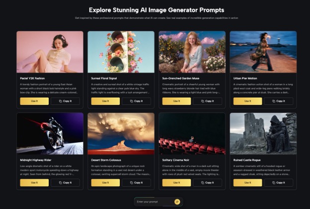
A prototype should be cheap in attention, not just money. If an artist has a thumbnail sketch, a blockout screenshot, or a rough character sheet, that can be enough to start exploring.
The goal is to preserve the useful structure while asking for a clearer rendering, alternate style, or different environment. A rough sketch might already solve composition. A greybox level might already establish scale. Do not throw away those decisions just because the source image is unfinished.
Reference-based editing is particularly helpful here because it lets the team say, “Keep this layout, but explore another mood,” instead of describing the entire scene from memory. That reduces accidental redesign and keeps the prototype tied to actual game constraints. It also makes feedback more precise. Team members can discuss the proposed change while recognizing which spatial or character decisions were intentionally preserved.
Build a Decision Sheet, Not a Folder Full of Pretty Images
Visual prototyping fails when the team generates dozens of attractive pictures and remembers none of the reasons behind them. Every test should end with a decision sheet.
| Design Question | Keep | Change | Next Test |
| Is the hero readable at gameplay scale? | Broad coat silhouette | Reduce small accessories | Test three movement poses |
| Does the town feel safe but strange? | Bright daytime palette | Make architecture less symmetrical | Try the market square |
| Can the faction stay recognizable? | Mask shape and red cloth | Simplify armor details | Test two new character roles |
This small record prevents the next round from restarting the same debate. It also gives artists a more useful handoff than a giant moodboard with no priorities. Add the date and the person who approved the direction when several people are involved. That tiny note can prevent an old rejected concept from resurfacing later.
Do Not Let Prototype Quality Become a Production Trap
Fast concept images can look finished long before the design is finished. That is dangerous because polish creates attachment. A team may keep a weak idea simply because one version has beautiful lighting or detailed textures.
Judge prototypes by the decision they help you make. If the question is character readability, ignore background beauty. If the question is world tone, ignore tiny costume details. If the question is faction consistency, compare recurring shapes and colors rather than rendering quality.
It also helps to label images clearly as tests. “Town mood B — wider streets, fewer signs” is more useful than “final_v7.” Names should describe the variable being explored. The easier it is to remember why an image exists, the less likely a prototype is to become accidental production art. Once a direction is approved, rebuild or refine it through the production process your team actually trusts rather than assuming the prototype itself is the endpoint.
Know Where Human Art Direction Still Matters Most
Generation can expand the option space, but it cannot decide what your game should communicate. That choice belongs to the people making the game.
Someone still has to notice that a villain looks too sympathetic, that a shop interior directs attention toward the wrong object, or that a character design conflicts with the game’s mechanics. Those judgments come from context that is larger than a single prompt.
Use visual tools to create evidence for discussion, not to avoid discussion. A good prototype should make the next human decision easier. If the team cannot explain why one direction works better than another, generating ten more variations probably will not solve the problem. Return to the design question and make it more specific. The tool can supply alternatives, but the team must supply criteria. Without criteria, more options usually create more noise rather than more certainty.
Conclusion
Indie teams do not need perfect concept art at the beginning. They need enough visual evidence to reject weak directions early and develop strong ones with confidence. Test one question at a time, use rough references when they already contain useful structure, record what each experiment taught you, and resist confusing polish with proof. The best prototype is not the prettiest image in the folder; it is the one that helps the team make a clear design decision. Before your next art sprint, choose one unresolved visual question and build a small test around that question first.


