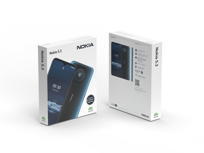
Nokia Mobile announcing new sales box design with Nokia 1.3, 5.3 and 8.3 5G

Nokia smartphones are now three years out there at the market, and some change in the designs was noticed. But, with the changes in the design of the phones, it is also needed to change the design of the sales boxes. I liked the blue Lumia boxes, but the white ones were a nice change in the design too. Nokia Mobile continued the story that Microsoft took, and refined the design of the boxes. They added the handshake enframed with the device, but that would move the focus out of the product. Nokia 1.3 was the first device to come with a new design of the sales box, and it does look good.

The print looks clean, straight forward, with clearly showing what is important, the device, and the Nokia logo next to it. The only thing I would like to see is that the color of the printed device matches the color of the device in the box. The actual color version doesn’t have to be on the front of the box but could be printed at the back. That might make boxing a bit more complex, but would be aesthetically pleasing.
The only thing I would move from the front and put it at the back is the 2 years of the android updates since that can be changed in the future, and it is a thing that can be placed on the summarized spec list. I also hope that there will be a place for some technologies used like OZO or PUreDisplay and so on.
What are your thoughts on this? do share them in the comments.


