
Nokia announces new Nokia Pure design style

The redesign announced by Nokia at MWC2023 isn’t just about a new business strategy and logo. It’s about a complete overhaul of everything Nokia does, and to do that, the company has had to develop an entirely new design style. Nokia calls it NokiaPure, and today it was presented to the world public.
The new design style was developed to make the digital products Nokia offers more consistent. The new logo is just the beginning, but Nokia Pure is everywhere, in all digital interfaces, apps and software components, and it looks great. The Finns are known for their great design, and Nokia Pure is as clean and minimalist as it gets. The new icons, graphics and letters look fresh, something all Nokia fans would love to see integrated into the UI of Nokia devices.
![]()
Nokia Pure brings not only the new Nokia Blue colours, but also typography, illustrations, UI icons, app icons, illustrations, data visualisations and much more. I must say that I like the fresh new look and I like even more that Nokia will implement some of its apps for wearable gadgets, as my dream of a Nokia (smart) watch is now hardly feasible.
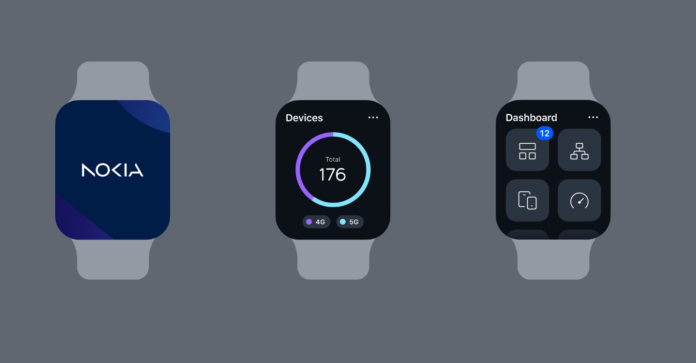
Although Nokia users would like to see the new Nokia Pure design style for Nokia UI applied to smartphones, it’s more likely to be experienced through a Nokia app like Nokia WiFi. Nokia doesn’t even use the Nokia smartphones for demonstration purposes.

If you want to see the Nokia Pure design elements, visit the Nokia Pure page.
Thanks Rocky for the tip 😉


